10 Reasons to Switch to Mac OS X Lion
Apple has released Mac OS X 10.7 Lion, with a slew of brand-new features and improvements for existing features and applications. Should you upgrade? I think you should, and for a simple reason: Lion helps you work better, faster, and protects your work from accidental loss. Those are powerful incentives to fork over your upgrade dollars.
First, let’s get the housekeeping out of the way. Of course, new Macs will come with Lion already installed. In order to upgrade to Lion, your existing Mac will have to meet some minimum hardware and software qualifications. First and foremost, you need to be already running Snow Leopard, Mac OS X 10.6.8. That’s because the fastest way to get Lion is to download it (all 3.75GB of it) for only $30 (it’s worth noting that previous major OS X upgrades cost $129) through the Mac App Store, which requires Snow Leopard. Once downloaded, Lion adheres to the same rules as any other Mac App Store purchase; you can install the software on any Macs you have that are authorized by the Apple ID you used to purchase the software. You don’t have to re-download Lion for each Mac; the download arrives as an Installer application that you can copy to a DVD, a USB flash drive, or over your wired or wireless network to each Mac. Beginning in August 2011, Apple will also begin selling Lion on a USB flash drive for $69.
In terms of hardware, you’ll need a Mac with an Intel Core 2 Duo, Core i3, Core i5, Core i7, or Xeon processor to run the new OS. To check your Mac’s processor, just click the Apple icon on the top left of your screen and select About This Mac; it’ll be listed right there (Figure 1). Mac models with Core 2 Duo processors, released in late 2006 or later, make the cut; older Core Duos will not. You’ll also need at least 2GB of RAM in your machine, though more RAM will provide snappier performance. Personally, I consider 4GB to be my minimum daily RAM requirement. And one important caveat: if you’re still using PowerPC-based applications, they won’t run on Lion, because Apple has removed Rosetta, the extension which translated the old code to run on Intel processors.
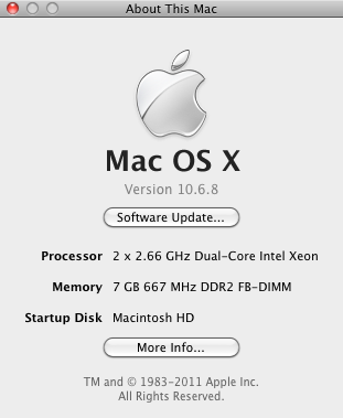
Figure 1. Check the About This Mac window to make sure you’re running the required versions of Mac OS X, have a sufficiently powerful processor, and have enough RAM for Lion.
So if you and your Mac are ready, let’s launch into our 10 reasons to upgrade to Lion.
1. Better Browsing
It’s a connected world, and the two most important applications for most of us are our Web browser and our email program. More on Mail’s improvements in a moment; let’s talk about Safari.
You know how if you had a lot of tabs open in Safari, misbehavior by a page in one tab could crash the whole browser? That’s much less likely to happen in Safari 5.1 under Lion (Safari 5.1 is also available for Snow Leopard). That’s because each tab or window now runs in its own “sandbox”, which is a separate process.
Under Lion, the old Downloads window is gone, replaced by a popover that appears when you click the Downloads button in the toolbar (Figure 2). When you start to download a file from a Web page, an icon jumps from the page into the Downloads toolbar icon, which then shows you a tiny progress bar. Items that you’ve downloaded can now be dragged directly from the Downloads popover; you don’t have to first click the magnifying glass icon to open your Downloads Folder.
Safari’s big new feature is Reading List, which is a sidebar that lets you save a Web page for reading later (Figure 3). If you’ve ever used the Web service/iOS app Instapaper, you’re already familiar with the concept, though Apple’s implementation only saves the URLs and a brief description in the sidebar, rather than the option of extracting the page’s content and rendering it as simpler text and graphics. In this sense, you can think of Reading List as improved bookmarking, rather than a replacement for Instapaper and similar services.
Safari now has better support for Web standards, such as HTML5, CSS3, MathML, and the Web Open Font Format (that last will bring support for real fonts and better typography to Web pages).
One nice tip: if you’re using a trackpad, double-tap on any spot in the page you’re viewing. Safari will zoom in on that spot. You can also use the Pinch gesture to zoom your pages.
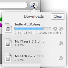
Figure 2. Clicking the new Downloads popover in the toolbar shows you current and past downloaded files.
2. Improved Apps
MailMail has some useful new features. As with previous major upgrades, Mail needs to update your mail database and do some other housekeeping, but after that you’re presented with the new interface. Apple has finally built in a proper three-pane view (previously only available via unofficial Mail plug-ins), with the mailbox list, message list, and message panes all easily visible (Figure 4). You can choose to group together related messages (previously called Threads) in Conversations, and each message appears separately in the message pane, allowing you to easily scroll through the conversation. A new Favorites Bar gives you one-click access to your mail folders, should you prefer to hide the mailbox list. And if you’ve ever been part of an e-mail conversation where some of the people feel the need to quote all of the text from all of the previous messages, Mail is now smart enough to hide all that extraneous quoted text.
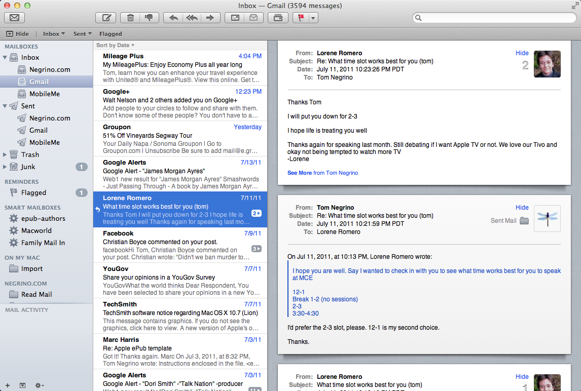
Figure 4. Mail’s new three-pane view allows you to use single messages or conversations in the message pane on the right.
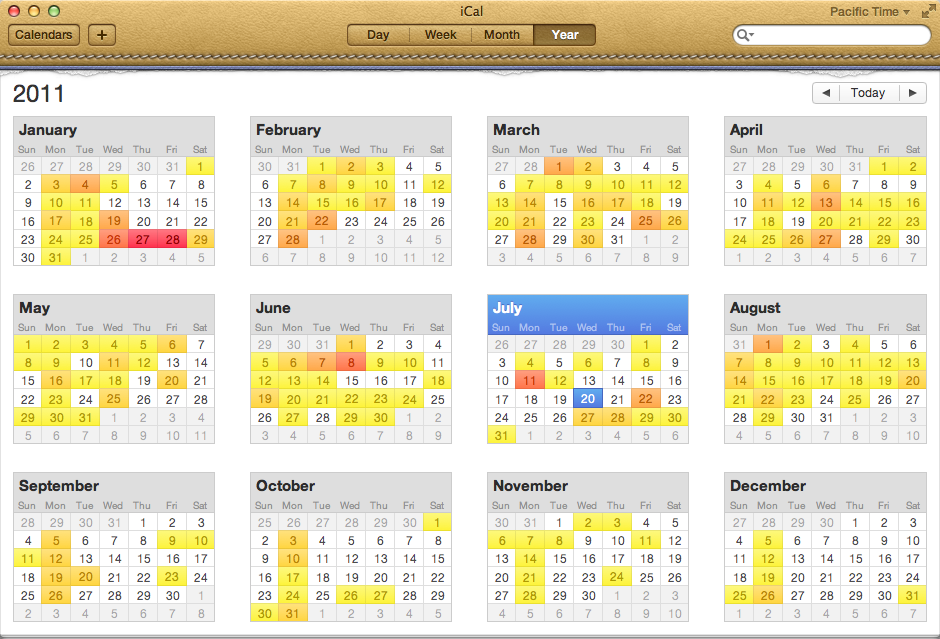
The included calendar program has received a face lift, with a completely gratuitous stitched-leather header. Instead of the mini-month views of previous versions, there’s now a useful Year view, with a “heat map” showing you busier days (Figure 5). The Day view is now a hybrid of just that day’s information and the rest of that week, though there’s still a dedicated Week view. The calendar pane on the left has been replaced with a popover, freeing precious space for the actual calendar view. iCal’s best new feature is natural-language event creation; clicking the Plus button in the toolbar, or double-clicking in one of the calendar views gives you a text field that allows you to enter something like “lunch with David on Friday at 12” and iCal will create a event called “Lunch with David” on Friday at 12 PM.
Previous versions of iChat had access to AIM and Google Talk and other servers using the Jabber protocol. iChat in Lion now supports Yahoo Messenger, and developers for other chat services can create plug-ins for iChat to add their service to the program. iChat now unifies the Buddy List, so no matter what service your friends use, they all appear in a single list. If a friend uses more than one service, you can choose which service to use for the chat when you open a new chat window.
Other AppsFaceTime is now built into Lion, letting you make video calls to other Macs, an iPad 2, an iPhone 4, or an iPod Touch with a camera. Address Book has a new look, making it resemble a paper book. And if you use iPhoto’s Faces feature, you can now associate people’s faces with their Address Book entries. For the geeks in the crowd, the Terminal window can now go full-screen, making your Mac just like a 1970’s text-only dumb terminal (is this really progress?). If you like to have your Mac perform lots of actions at a single command, Automator comes with new actions, such as the ability to turn text document into ePub books, and retrieve Web content.
3. Full Screen Apps
If the application supports it, Lion enables the program to be expanded to fill your entire screen, even covering up the menu bar (moving the mouse to the top of the screen makes the menu bar visible again). This is great for apps that need to eke out every bit of screen real estate, such as iPhoto, Preview, and even Mail. Almost all of the major applications that Apple makes, including Safari, Terminal, and all the iLife apps, already support full-screen mode.
To enter full-screen mode, click on the small diagonal-arrow icon at the upper-right corner of the window’s title bar. To exit the mode, move your mouse to the upper edge of the screen, so the menu bar reappears, then click on the blue diagonal arrow toggle button at the upper-right. With some applications, you can press the Escape key.
Some apps work really well when they take up the full screen (an idea, incidentally, that shows how Lion is a melding of Mac OS X and iOS). For example, programs that are already essentially single windows, such as GarageBand and iTunes, make good use of every screen pixel, especially on machines with smaller displays such as the 11-inch MacBook Air. Other programs aren’t so successful. Safari, in particular, doesn’t benefit from a window that takes up the entire width of the screen, because web pages simply aren’t designed that way. Another drawback of full-screen mode is that if you have more than one monitor, one display shows the full-screen application, but the other shows nothing but a background texture. You can’t have two apps running in full-screen mode, with one on each display. If you run more than one monitor, you probably won’t find full-screen mode to be terribly useful.
4. Mission Control
Mac OS X allows you to have many applications running at once, and each of those applications generally has one or more windows. Over the years, Apple has introduced a variety of features intended to help you manage your windows better. Exposé, Dashboard, and Spaces have all been attempts to de-clutter our desktops. Now Lion brings us Mission Control, which tries to consolidate the features that came before. Activating Mission Control by clicking its icon in the Dock, with a keyboard shortcut, swiping up on your trackpad with three fingers, or moving the cursor into a hot corner causes the desktop picture to recede into the center the screen. On top of the desktop pattern you’ll see Windows with badges of the icons to which they belong. At the top of the screen, each full-screen application creates a different Space, along with Dashboard, which is now a Space in its own right (Figure 6).
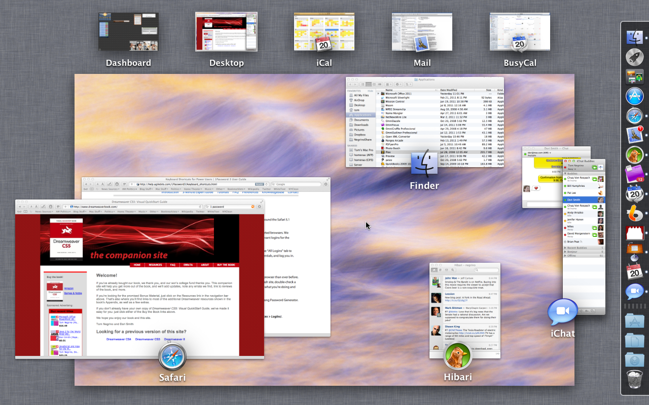
Figure 6. Mission Control gives you an overview of your desktop, your full-screen applications, and groups windows from given applications together.
As was the case with Exposé, you can click on any window to bring it to the front. You can create additional desktops in the line at the top of the screen by moving the cursor (or dragging a window from your Desktop) to the upper-right or upper-left corner (depending on how you have your Dock positioned), which makes a panel with a + appear. You can drag windows from one desktop to another (but not to the Spaces that are made from full-screen applications). Once you exit Mission Control, you can switch between the different Spaces by using a keyboard command (by default, Control-right arrow or Control-left arrow), or by swiping right or left on your trackpad with three fingers. Overall, Mission Control isn’t quite as flexible as the individual features it replaces, but it is more approachable and should be more understandable, especially for novice users.
5. Launchpad
Just as Mission Control is intended to make window management easier, the new Launchpad tries to do the same with application management. Shamelessly lifted from the iOS Springboard, clicking the Launchpad icon in the Dock (or invoked with other methods, much like Mission Control) hides everything else on your screen and makes your applications appear as icons in one or more scrollable pages, just like on an iOS device (Figure 7). Apple reserves the first page for its own applications, then the other applications in your Applications folder appear alphabetically on subsequent pages. You scroll between pages using trackpad gestures or the right or left arrow keys. Just as in iOS, you can rearrange applications by dragging them around on the same page or between pages. By dragging icons on top of one another, you can create renameable folders (Figure 8).
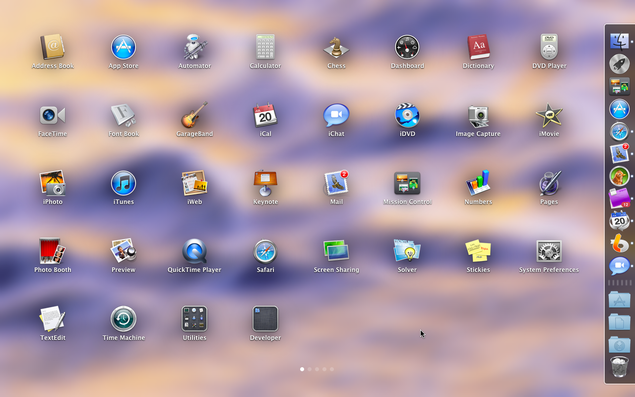
Figure 7. Launchpad allows you to access your applications without having to dig into your Applications folder, and is designed for users who are already familiar with dealing with apps on iOS devices.
Launchpad solves a familiar problem: most people prefer to keep the programs they use the most often in the Dock, but when you get a lot of programs in the Dock, their icons become ridiculously small. But experienced users already use other solutions to deal with a plethora of apps (I use an excellent utility called LaunchBar). Launchpad will work well for novice users, and people who don’t have a lot of apps. But organizing apps in Launchpad is as much of a drag (pun intended) as it is in iOS; there’s an awful lot of clicking and dragging. I suspect that experienced users will keep using their organization utilities (skipping Launchpad altogether), and less expert users will arrange their most used apps onto Launchpad’s first couple of pages and be done with it.
6. Auto Save and Versions
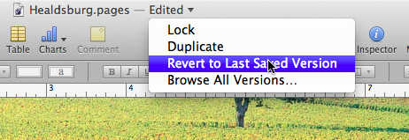
I’ve been a Mac user for 27 years, and probably the most deeply-ingrained habit I have is to press Command-S to save my current document. I’ve lost enough work over the years by failing to save before a program crashed so that constant saving is simply second nature. Lion’s Auto Save feature promises to relegate my saving habit to history. Once a program has been updated to take advantage of Auto Save, documents that you work on will simply be saved; you don’t have to do a thing. Except for newly created documents, choosing Save from the File menu just won’t be necessary (in fact, it will do something different, as we’ll see in a moment). When you’re done working and quit the app or close the window, your old friend the Save/Don’t Save/Cancel dialog doesn’t appear, because your work is already saved. If you decide you don’t like the work that you’ve done, any application that uses Auto Save also allows you to Revert from the menu in the center of the title bar to the version the document was in when you last opened it (Figure 9).
Working along with Auto Save is the new Versions feature, which is kind of like Time Machine, but for documents within applications. Pressing Command-S now activates the Save a Version command, which saves snapshots that record the history of the document. Every time you open a document, Lion automatically saves the current version. If you don’t force saving a version by pressing Command-S, Lion still automatically saves a version every hour. Your hard drive doesn’t get overrun with versions, because Lion only saves the changes from one version to another. Like Time Machine, version history is kept hourly for a day, daily versions for a month, and weekly versions for the months before that. You can compare versions, browsing through the current and past versions (Figure 10). You can copy and paste between versions, restore a previous version entirely, and even delete past versions if you like.
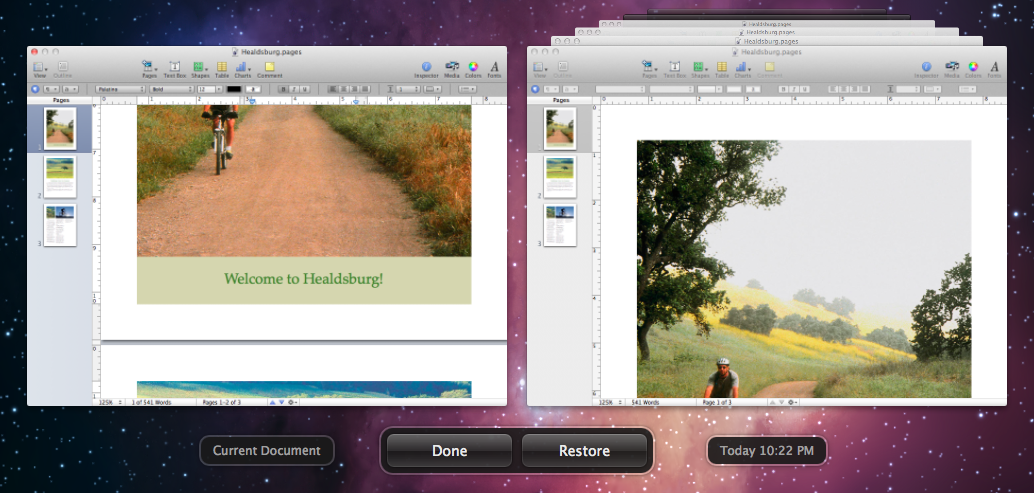
Figure 10. You can click through your previous versions, and the document windows are live, so you can scroll previous versions and move elements from previous versions into the current version.
7. Resume
The new Resume feature is so simple and obvious, you wonder why it wasn’t introduced years ago. When you launch an application, it appears just the way you left it. All the open windows, panes, and palettes come back just the same way they were when you quit. This isn’t just for a single application; when you restart your computer, Lion takes a quick snapshot of your system and everything comes back just the way you left it. Any apps that were running reopen, along with their document windows. Depending on how much stuff you have open, it may take a while to restart. But overall, Resume is brilliant.
8. Better File Management
The Finder has changed in some interesting ways in Lion. Let’s start with the Finder windows. Apple’s latest design decision is to remove all the color from the items in the sidebar. This is not a decision I support; I think it makes it a little harder to find the item you’re looking for.
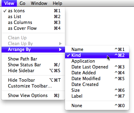
The new All My Files view is a search for files you might want to work with, including images, movies, presentations, spreadsheets, and more, divided by category (Figure 11). If you have the Finder window set to icon view, you can scroll each category horizontally, in the Cover Flow style. This is courtesy of the new way the Arrange By command in the Finder’s View menu works (Figure 12). You can use this in any Finder window, not just All My Files.
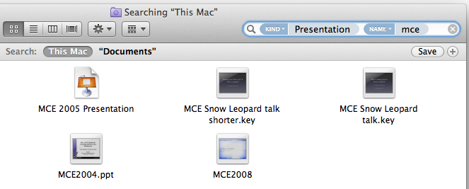
Searching in the Finder is also improved. The Search field in every Finder window’s toolbar now uses “tokens” to narrow down your search results. When you begin typing a term in the field, you get a pop-up menu that can limit the scope of the search terms. For example, you can begin by typing key, and the pop-up menu suggests “Kinds: Keynote Document.” Press Return, and you can type a filename to narrow the search further (Figure 13).
If you select multiple files, in the File menu there’s a New Folder with Selection command that creates a new folder, moves the selected files into it, and highlights the name of the new folder so you can name it, all in one operation. Nice.
9. Gestures and Scrolling
Got a trackpad? If so, Lion is going to give you a lot of new options. Gestures are a big part of Lion, and there are a bunch of new gestures that are baked into the system. You’ll find a complete description of all the gestures in the Trackpad preference pane (Figure 14). Some gestures are new, such as a double tap with three fingers, which makes a popover appear of the word under the cursor with the dictionary definition, thesaurus entry, and a Wikipedia link (Figure 15). Let’s be clear: you don’t need a trackpad to get the most out of Lion. Many of the things you can do with gestures you can do with keyboard shortcuts for menu choices. If you’re using one of Apple’s notebooks with a trackpad, or using the Bluetooth Magic Trackpad meant for desktop machines, you’ll get options that can make things faster and easier.
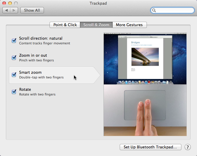
Figure 14. You can discover all the Lion gestures in the Trackpad preference pane, with handy video that shows you how each gesture is done.
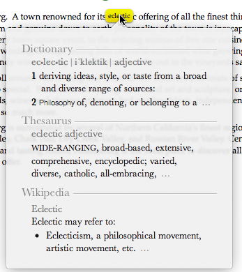
Figure 15. If you’re not sure you’ve got the right word in your document, there’s a gesture for that.
There is, however, one controversial change in Lion that’s turned on by default. Apple has reversed the scroll direction so that it matches scrolling on the iPhone and iPad. The Scroll direction: natural setting in the Trackpad preference pane makes the content on the screen move in the same direction as your scrolling fingers. So if you scroll up with two fingers on the trackpad (moving your fingers toward the screen), the document window will scroll down. It’s as though you’re pushing the document content up inside the frame that it’s in. Even though this is backwards from the way the Mac has done its scrolling since, well, forever, I discovered that it really doesn’t take very long to get used to the new way of doing things. And if you don’t like it, it’s a preference that can be easily turned off, reverting to the previous way of scrolling.
The other weird thing about scrollbars under Lion is that as under iOS, if you’re using a trackpad, they aren’t there unless they’re being used. Scollbars only appear when you’re actually scrolling. This can be disconcerting, but it’s another preference that can be changed back to the old way, in this case in the General Preference pane.
One very welcome change in Lion is that you can now resize a window from any edge. The resize handle in the bottom right corner of the window is gone. To resize any window now, just move your cursor to any of its edges and start dragging. Of course, dragging from a corner resizes the window in both dimensions.
10. AirDrop
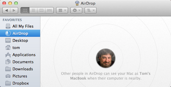
Let’s say that your in a room with one or more other people that are running Lion. You’d like to transfer a file or two from one machine to another, but nobody has a USB flash drive. The new AirDrop feature deals with that problem by setting up a direct Wi-Fi connection between two Macs. If both computers are connected to the same Wi-Fi network, no problem; AirDrop makes a direct peer-to-peer connection. Best of all, it doesn’t require any prior set up. In the sidebar of a Finder window, there is a new AirDrop icon; click it and you see icons of your machine and nearby AirDrop-capable Macs (Figure 16). AirDrop depends on the version of the WiFi hardware in your Mac, and is supported by most recent Macs. See http://support.apple.com/kb/HT4783 for a complete list
Your Upgrade Decision
As with any operating system upgrade, you have to balance the perils (the time it will take you to learn new things, replacing or upgrading incompatible software) with the benefits (the cost of the upgrade, the usefulness of its new features). On balance, I think that the $30 you spend on Lion are well spent. The benefits of just a couple of Lion’s new features (I’m thinking particularly here of Auto Save and less chance of crashing in Safari) have a great potential to save you time and heartache. Make sure that the software that you use is Lion-compatible, and you’ll be ready to take the plunge.

